Visualizing hypergraphs
Visualizing hypergraphs, just like pairwise networks, is a hard task and no algorithm can work nicely for any given input structure. Here, we show how to visualize some toy structures using the visualization function contained in the drawing module that is often inspired by networkx and relies on matplotlib.
[1]:
import matplotlib.pyplot as plt
import numpy as np

import xgi
Basics
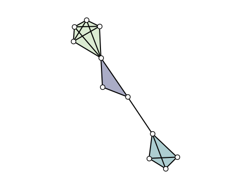
Les us first create a small toy hypergraph containing edges of different sizes.
[2]:
H = xgi.Hypergraph()
H.add_edges_from(
    [[1, 2, 3], [3, 4, 5], [3, 6], [6, 7, 8, 9], [1, 4, 10, 11, 12], [1, 4]]
)
It can be quickly visualized simply with
[3]:
xgi.draw(H)
[3]:
(<AxesSubplot: >,
 (<matplotlib.collections.PathCollection at 0x17f5c7b20>,
  <matplotlib.collections.LineCollection at 0x17f5e8820>,
  <matplotlib.collections.PatchCollection at 0x17f5c7f70>))
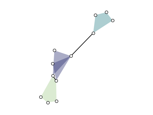
By default, the layout is computed by xgi.barycenter_spring_layout. For a bit more control, we can compute a layout externally (that we fix with a random seed), so that we can reuse it:
[4]:
pos = xgi.barycenter_spring_layout(H, seed=1)

fig, ax = plt.subplots()
xgi.draw(H, pos=pos, ax=ax)
[4]:
(<AxesSubplot: >,
 (<matplotlib.collections.PathCollection at 0x17f81d9f0>,
  <matplotlib.collections.LineCollection at 0x17f88ad70>,
  <matplotlib.collections.PatchCollection at 0x17f8c71f0>))
Labels can be added to the nodes and hyperedges with arguments node_labels and hyperedge_labels. If True, the IDs are shown. To display user-defined labels, pass a dictionary that contains (id: label). Additional keywords related to the font can be passed as well:
[5]:
xgi.draw(H, pos, node_labels=True, node_size=15, hyperedge_labels=True)
plt.show()
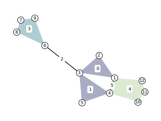
Note that by default, the nodes are drawn too small (size 7) to display the labels nicely. For better visuals, increase the node size to at least 15 when displaying node labels.
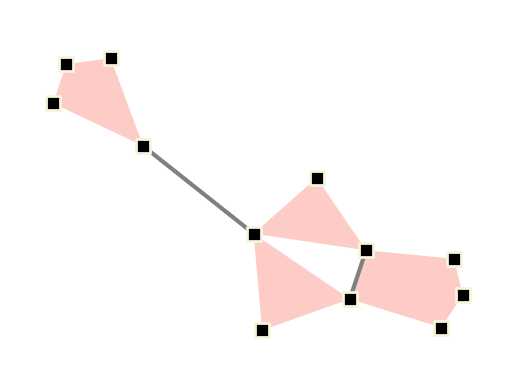
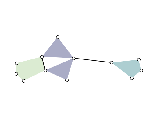
Other types of visualizations
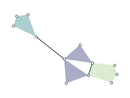
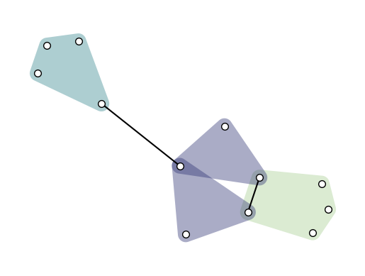
Another common way of visualizing hypergraph is with convex hulls as hyperedges. This can be done simply by setting hull=True:
[6]:
fig, ax = plt.subplots()
xgi.draw(H, pos=pos, ax=ax, hull=True)

plt.show()
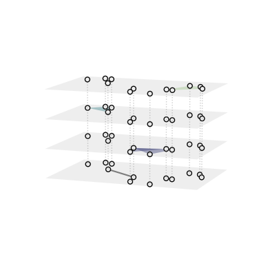
XGI also offer a function to visualize a hypergraph as a multilayer, where each layer contains hyperedges of a given order:
[7]:
ax3 = plt.axes(projection="3d")  # requires a 3d axis
xgi.draw_multilayer(H, ax=ax3)

plt.show()
Colors and sizes
The drawing functions offer great flexibility in choosing the width, size, and color of the elements that are drawn.
By default, hyperedges are colored according to their order. Hyperedge and node colors can be set manually to a single color, a list of colors, or a by an array/dict/Stat of numerical values.
In the latter case, numerical values are mapped to colors via a colormap which can be changed manually (see colormaps for details):
First, let’s use single values:
[8]:
fig, ax = plt.subplots()

xgi.draw(
    H,
    pos=pos,
    ax=ax,
    node_fc="k",
    node_ec="beige",
    node_shape="s",
    node_size=10,
    node_lw=2,
    edge_fc="salmon",
    dyad_color="grey",
    dyad_lw=3,
)

plt.show()
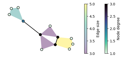
Now we can use statistic to set the colors and sizes, and change the colormaps:
[9]:
fig, ax = plt.subplots(figsize=(6, 2.5))

ax, collections = xgi.draw(
    H,
    pos=pos,
    node_fc=H.nodes.degree,
    edge_fc=H.edges.size,
    edge_fc_cmap="viridis",
    node_fc_cmap="mako_r",
)

node_col, _, edge_col = collections

plt.colorbar(node_col, label="Node degree")
plt.colorbar(edge_col, label="Edge size")

plt.show()
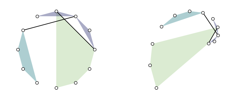
Layouts
Other layout algorithms are available: * random_layout: to position nodes uniformly at random in the unit square (exactly as networkx). * pairwise_spring_layout: to position the nodes using the Fruchterman-Reingold force-directed algorithm on the projected graph. In this case the hypergraph is first projected into a graph (1-skeleton) using the xgi.convert_to_graph(H)
function and then networkx’s spring_layout is applied. * barycenter_spring_layout: to position the nodes using the Fruchterman-Reingold force-directed algorithm using an augmented version of the the graph projection of the hypergraph, where phantom nodes (that we call barycenters) are created for each edge of order \(d>1\) (composed by more than two nodes). Weights are then
assigned to all hyperedges of order 1 (links) and to all connections to phantom nodes within each hyperedge to keep them together. Weights scale with the size of the hyperedges. Finally, the weighted version of networkx’s spring_layout is applied. * weighted_barycenter_spring_layout: same as barycenter_spring_layout, but here the weighted version of the Fruchterman-Reingold
force-directed algorithm is used. Weights are assigned to all hyperedges of order 1 (links) and to all connections to phantom nodes within each hyperedge to keep them together. Weights scale with the order of the group interaction.
Each layout returns a dictionary that maps nodes ID into (x, y) coordinates.
For example:
[10]:
plt.figure(figsize=(10, 4))

ax = plt.subplot(1, 2, 1)
pos_circular = xgi.circular_layout(H)
xgi.draw(H, pos=pos_circular, ax=ax)

ax = plt.subplot(1, 2, 2)
pos_spiral = xgi.spiral_layout(H)
xgi.draw(H, pos=pos_spiral, ax=ax)
[10]:
(<AxesSubplot: >,
 (<matplotlib.collections.PathCollection at 0x17fc295d0>,
  <matplotlib.collections.LineCollection at 0x17fc291e0>,
  <matplotlib.collections.PatchCollection at 0x17fa2f700>))
Simplicial complexes
Simplicial complexes can be visualized using the same functions as for Hypergraphs.
Technical note: By definition, a simplicial complex object contains all sub-simplices. This would make the visualization heavy since all sub-simplices contained in a maximal simplex would overlap. The automatic solution for this, implemented by default in all the layouts, is to convert the simplicial complex into a hypergraph composed solely by its maximal simplices.
Visual note: To visually distinguish simplicial complexes from hypergraphs, the draw function will also show all links contained in each maximal simplices (while omitting simplices of intermediate orders).
[11]:
SC = xgi.SimplicialComplex()
SC.add_simplices_from([[3, 4, 5], [3, 6], [6, 7, 8, 9], [1, 4, 10, 11, 12], [1, 4]])
[12]:
pos = xgi.barycenter_spring_layout(SC, seed=1)
[13]:
xgi.draw(SC, pos=pos)

plt.show()
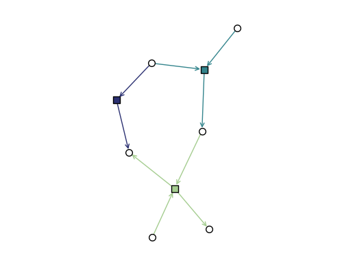
DiHypergraphs
We visualize dihypergraphs as directed bipartite graphs.
[14]:
diedges = [({0, 1}, {2}), ({1}, {4}), ({2, 3}, {4, 5})]
DH = xgi.DiHypergraph(diedges)
[15]:
xgi.draw_bipartite(DH)
[15]:
(<AxesSubplot: >,
 (<matplotlib.collections.PathCollection at 0x17f9c4cd0>,
  <matplotlib.collections.PathCollection at 0x17f9c4610>))
Drawing hypergraphs as bipartite graphs
Not only can we draw dihypergraphs as bipartite graphs, but we can also draw undirected hypergraphs as bipartite graphs.
[16]:
xgi.draw_bipartite(H)
[16]:
(<AxesSubplot: >,
 (<matplotlib.collections.PathCollection at 0x17f5dbac0>,
  <matplotlib.collections.PathCollection at 0x17f5dbe20>,
  <matplotlib.collections.LineCollection at 0x17f5eb9d0>))
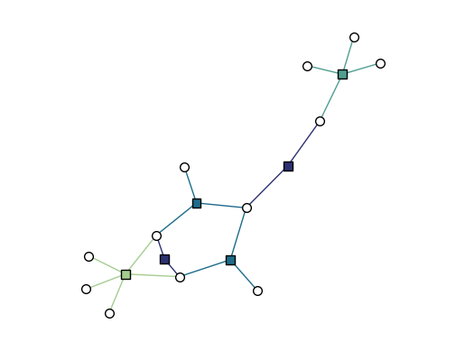
Now, instead of a single dictionary specifying node positions, we must specify both node and edge marker positions. The bipartite_spring_layout method returns a tuple of dictionaries:
[17]:
pos = xgi.bipartite_spring_layout(H)
pos
[17]:
({1: array([0.04220608, 0.26866056]),
  2: array([0.49436403, 0.17768246]),
  3: array([0.14714446, 0.03094405]),
  4: array([-0.12267079,  0.35109355]),
  5: array([0.01132151, 0.53141135]),
  6: array([ 0.05306611, -0.55582422]),
  7: array([-0.20957516, -0.80710168]),
  8: array([ 0.07044058, -0.98534635]),
  9: array([-0.10909147, -1.        ]),
  10: array([-0.34864708,  0.56110341]),
  11: array([-0.2442516 ,  0.68201836]),
  12: array([0.04980448, 0.62431623])},
 {0: array([0.2778255 , 0.16929486]),
  1: array([0.06275829, 0.32248053]),
  2: array([ 0.11469353, -0.27099664]),
  3: array([-0.03209532, -0.8173815 ]),
  4: array([-0.13396712,  0.50866042]),
  5: array([-0.12332603,  0.20898462])})
We can change the style of any of the plot elements just as we can for draw. In addition, we can use any of the layouts described above with the edge_positions_from_barycenters function, to place the edge markers directly between their constituent nodes.
[18]:
node_pos = xgi.circular_layout(H)
edge_pos = xgi.edge_positions_from_barycenters(H, node_pos)
xgi.draw_bipartite(
    H,
    node_shape="p",
    node_size=10,
    edge_marker_size=15,
    dyad_style="dashed",
    pos=(node_pos, edge_pos),
)
[18]:
(<AxesSubplot: >,
 (<matplotlib.collections.PathCollection at 0x17f5e8e80>,
  <matplotlib.collections.PathCollection at 0x17f9a2b00>,
  <matplotlib.collections.LineCollection at 0x17f9c4b80>))
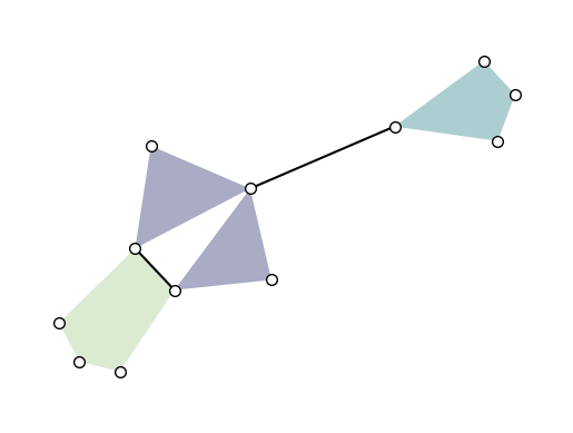
Rotating a hypergraph
For some hypergraphs, it can be helpful to rotate the positions of the nodes relative to the principal axis. We can do this by generating node positions with any of the functions previously described and then using the function pca_transform(). For example:
[19]:
pos = xgi.barycenter_spring_layout(H, seed=1)

transformed_pos = xgi.pca_transform(pos)
xgi.draw(H, transformed_pos)

plt.show()
We can also rotate the node positions relative to the principal axis:
[20]:
# rotation in degrees
transformed_pos = xgi.pca_transform(pos, 30)
xgi.draw(H, transformed_pos)

plt.show()
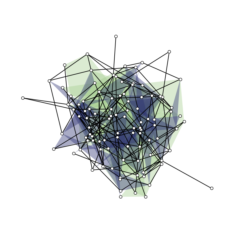
Larger example: generative model
We generate and visualize a random hypergraph.
[21]:
n = 100
is_connected = False
while not is_connected:
    H_random = xgi.random_hypergraph(n, [0.03, 0.0002, 0.00001])
    is_connected = xgi.is_connected(H_random)
pos = xgi.barycenter_spring_layout(H_random, seed=1)
Since there are more nodes we reduce the node_size.
[22]:
plt.figure(figsize=(10, 10))
ax = plt.subplot(111)
xgi.draw(H_random, pos=pos, ax=ax)
[22]:
(<AxesSubplot: >,
 (<matplotlib.collections.PathCollection at 0x17fc79a50>,
  <matplotlib.collections.LineCollection at 0x17fc78850>,
  <matplotlib.collections.PatchCollection at 0x17fdbd0c0>))
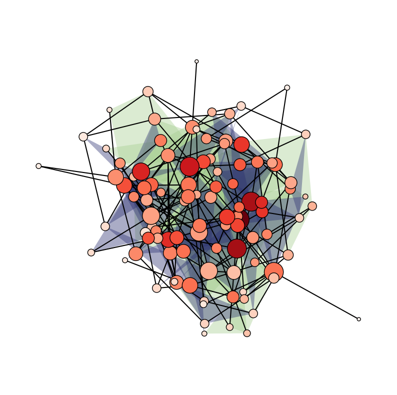
We can even size/color the nodes and edges by NodeStats or EdgeStats (e.g., degree, centrality, size, etc.)!
[23]:
plt.figure(figsize=(10, 10))
ax = plt.subplot(111)
xgi.draw(
    H_random,
    pos=pos,
    ax=ax,
    node_size=H_random.nodes.degree,
    node_fc=H_random.nodes.clique_eigenvector_centrality,
)
[23]:
(<AxesSubplot: >,
 (<matplotlib.collections.PathCollection at 0x17fcf2500>,
  <matplotlib.collections.LineCollection at 0x17fc791b0>,
  <matplotlib.collections.PatchCollection at 0x17fcf2320>))
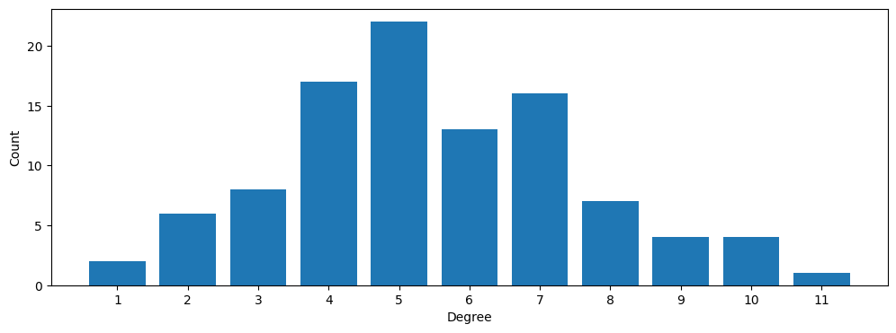
Degree distribution
Using its simplest (higher-order) definition, the degree is the number of hyperedges (of any size) incident on a node.
[24]:
centers, heights = xgi.degree_histogram(H_random)

plt.figure(figsize=(12, 4))
ax = plt.subplot(111)

ax.bar(centers, heights)
ax.set_ylabel("Count")
ax.set_xlabel("Degree")
ax.set_xticks(np.arange(1, max(centers) + 1, step=1));
[25]:
plt.close("all")